Farrow & Ball’s latest shade, Yonder, is gaining significant attention in the interior design world. This vibrant yet soothing blue is being hailed as a modern interpretation of traditional blue paints, striking a balance between brightness and warmth. Designers are now weighing in on whether this trending color will maintain its popularity or fade away.
The appeal of Yonder lies in its unique qualities. Unlike conventional blue paints, which can often feel cold or overly muted, Yonder brings a sense of joy and vitality to any space. Patrick O’Donnell, brand ambassador at Farrow & Ball, describes it as “the crispest and freshest of our light blues,” reminiscent of bright coastal skies. He notes that the paint’s slight undertone of black prevents it from appearing too sharp.
Yonder is particularly effective in south-facing rooms, where it can bask in natural light, creating an ambiance that feels optimistic and welcoming. According to O’Donnell, this color is ideal for spaces that benefit from good lighting, such as living rooms and children’s bedrooms.
Designing with Yonder: Insights from Experts
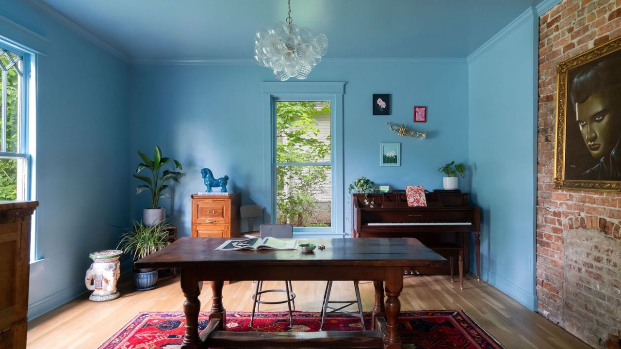
Homeowners and designers are finding innovative ways to incorporate Yonder into their spaces. For instance, Kristin Bock of Bock Building Co. recently transformed a parlor by color-draining the entire room in Yonder. She explains, “I wanted this room to be fun, and Yonder was the perfect choice. It creates a playful atmosphere, making me feel happy every time I walk through.”
Similarly, Lucy Williams of Lucy Williams Home utilized Yonder throughout her living room. The combination of the blue paint with warm wood tones and a rich, tobacco-colored sofa results in a snug yet vibrant space. Williams highlights the versatility of Yonder, noting that it maintains its charm under various lighting conditions, making it suitable for frequently used areas like living rooms.
Interior designer Sarah Southwell used Yonder in a child’s bedroom, praising its cheerful and uplifting qualities. She describes it as a color that “instantly energizes the room,” making it a perfect choice for creating a joyful atmosphere in children’s spaces.
Creative Applications of Yonder
There are numerous ways to use Yonder effectively in home design. For those looking to make a bold statement, painting an entire room in Yonder can create a dramatic effect. Experts recommend pairing it with earthy neutrals to achieve a cohesive look. O’Donnell suggests matching Yonder with pure whites like All White or contrasting it with deeper tones such as brown or blue-green shades for a layered aesthetic.
Yonder also shines as an accent color. By applying it to woodwork or cabinetry, homeowners can introduce a playful yet timeless element to their decor. The blue works particularly well alongside soft beige walls, creating a balanced and inviting environment.
As the popularity of Yonder continues to rise, its adaptability makes it a favorite among designers and homeowners alike. Although currently a trending color, the thoughtful applications seen in various spaces suggest that Yonder may have lasting appeal. With its ability to enhance a room’s personality without being tied to fleeting trends, Yonder is more than just a color; it is a way to create inviting and vibrant spaces.
From cozy living rooms to cheerful children’s bedrooms, Yonder is proving to be a versatile paint choice that resonates with many. As the interior design community embraces this shade, it seems poised to establish itself as a classic option for years to come.